I Want To Be A Roitfeld

Kellina de Boer
EDITOR-IN-CHIEF

Dara Block
STYLE EDITOR

CONTRIBUTING EDITORS
Jessica Eritou
Renee Hernandez
Bernie Rothschild

quoi de neuf
   
Carine Roitfeld

Apartment

Closet

Library

Julia Restoin-Roitfeld

Apartment

Closet

Library

Beauty Products

HOW TO BE A ROITFELD

Beauty Secrets

Style Tips

Recipes

IWTB SHOP

Mademoiselle C

Mademoiselle C (2013)
Directed by Fabien Constant

IWTB Interview:
Fabien Constant

ORDER DVD

VIEW TRAILER

CR FASHION BOOK

Harper's Bazaar

carine roitfeld: irreverent
THE LITTLE BLACK JACKET

I Want To Be An Alt

I Want To Be A Coppola

I Want To Be A Battaglia

IWTB RECOMMENDS

Tom Ford
By Tom Ford


Yves Saint Laurent 
By Roxanne Lowit


The Big Book of the Hamptons
By Michael Shnayerson


A Message for You
By Guy Bourdin


Dior: The Legendary Images
By Florence Muller


Marella Agnelli: The Last Swan
By Maria Agnelli


Fashionable Selby
By Todd Selby


O.Z. Diary
By Olivier Zahm 

« Happy 30th Birthday Vladimir Restoin-Roitfeld! | Main | Carine Roitfeld: Rare Gems »
jeudi
déc.112014

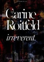
Carine Roitfeld: What Is A Good Cover Anyway?

In writing the foreword to Vogue Paris Covers: 1920-2009 by Sonia Rachline, Carine Roitfeld poses a fascinating question: What is a good cover anyway? She then proceeds to answer her own question with her typical aplomb. I loved reading about Carine's thought process as she decides on a cover so I thought I would share her words with you along with a selection of my favorite covers she has created. Which are your favorite covers by Carine Roitfeld?

Foreword to Vogue Paris Covers: 1920-2009

Creating a cover is at once exciting and stressful. How can you be sure of your work — certain that you got it right? And what is a good cover anyway? Is it one that encourages people to buy the magazine? Or where the quality of the image has lasting interest? One or two things you learn from experience: the visual immediacy of the graphics, a clearly defined goal, a model who looks straight at the camera and holds the reader's gaze, a touch of luxury — all of these work to one's advantage. Gold, silver, red and pink lettering work well, whereas green does not. Humor is appealing, nudity less so. And yet those guidelines alone are no guarantee of commercial or artistic success, as we see if we look back through the magazine's archives, trawling through ninety years of graphic design. This is particularly true of Vogue, which has traditionally relied on a bold, even iconoclastic approach. So, what does that mean? For a visually attuned person like myself, a good cover is a pleasure to look at, and has an impact that one can return to without getting tired of it, but it is also underpinned by an idea, a way of looking at things that is entirely subjective. At the end of the day, there is only one recipe for success as I see it: a cover must be true to itself.

Carine Roitfeld
Editor-in-Chief, Vogue Paris

connect with iwtbar bloglovin | facebook | pinterest | tumblr | twitter

Cover images © 2014 CR Fashion Book and Condé Nast. All Rights Reserved.

PrintView Printer Friendly Version

EmailEmail Article to Friend

Reader Comments (6)

Just like every fashion fanatics is saying.. Paris Vogue is way better when Carine was the Editor-in-chief. She has a vision and style on how the magazine should look like. Paris Vogue's golden years was under Madame de Roitfeld. Also, I notice that when she step down as the editor of PV, fashion become tamer, lame and lost. Lastly, I hate the fact that it's Carine who had help to promote Kim Kartrashian and (her sister kendull) thinks that they're a modern fucking fashion icon!
11 décembre 2014 | Unregistered CommenterBernie
Bernie, one thing stood out for me when reviewing Carine's covers for this post — often I can recall other images from the issue based on its cover image. Typically her work maintains a delicate balance between distinct and cohesive, no easy feat.

Now which are your favorite CR covers?! So very curious to know...
11 décembre 2014 | Registered Commenterkellina
So many great covers from Mademoiselle C! I love the Cora E. cover and the Liya Kebebe issue! I love the Dec/Jan Casta and Sofia as well! I want to lay every issue down and roll around on them! - TMI???
12 décembre 2014 | Unregistered Commenterpfkolyer
Great choice for the images. I remember most of these covers.
12 décembre 2014 | Unregistered CommenterMike
I think thats what happened if you have a vision of the magazine if you want because it leads you towards a great direction. Carine is just like Diana Vreeland! Both have vision, distinctly sharp style that leads their magazines direction for DV its always eccentric and extravaganyt, while CR is sharp, erotic and sharp! Thats all!!
12 décembre 2014 | Unregistered CommenterBernie
Love your TMI Paul can I come over and see you roll around??? Lol. Great photo montage for the eyes. CR is no doubt talented. And, Just saying, Bernie's positive bias for CR is no suprise we know, we know EA is not as great in your eyes...
13 décembre 2014 | Unregistered CommenterMyT

PostPost a New Comment

Enter your information below to add a new comment.

My response is on my own website »
Author Email (optional):
Author URL (optional):
Post:
 
All HTML will be escaped. Hyperlinks will be created for URLs automatically.